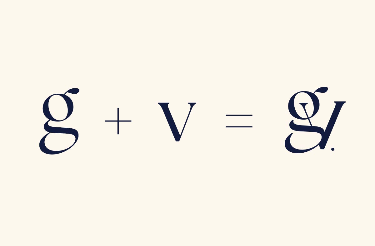
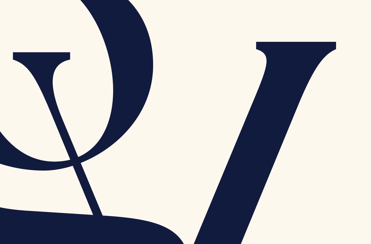
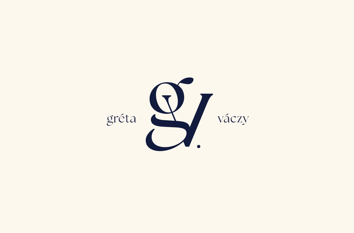
The logo displayed in the presentation is a fusion of the initials of Gréta’s family name and first name. There was a specific request for the strong family unity to be prominently and elegantly represented. The connection between the two letters was crafted using a distinctive serif typeface. Its design is sleek and pleasing to the eye. The combined application of the elements reinforces each other on both dark and light surfaces. The monochromatic color usage ensures the longevity of the completed artwork for decades. Gréta intends to apply her new logo in numerous fields.