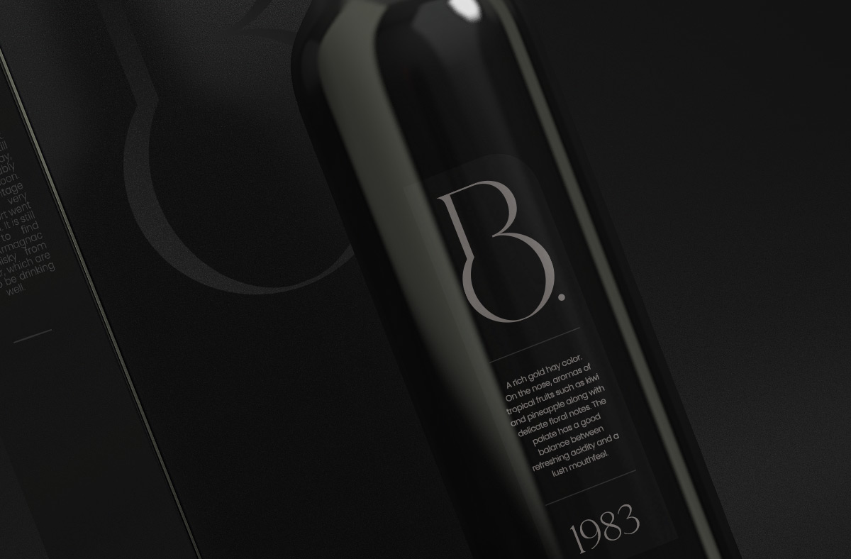
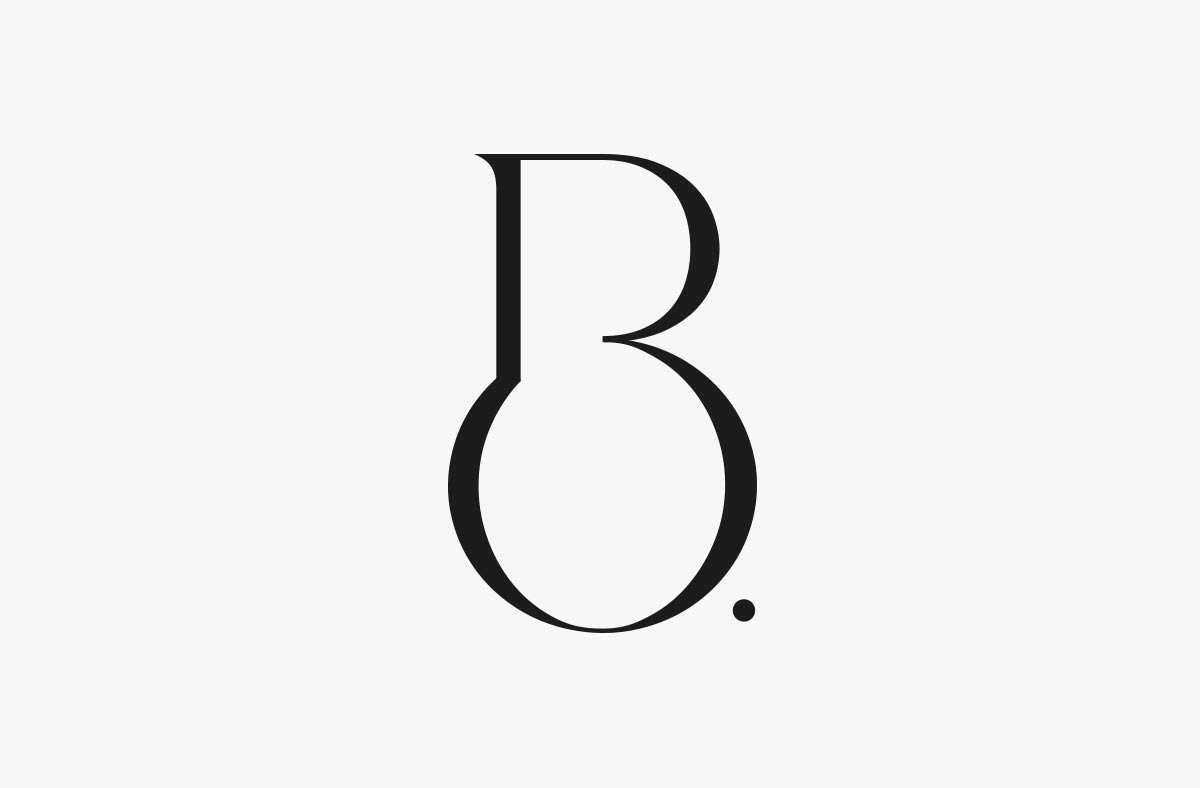
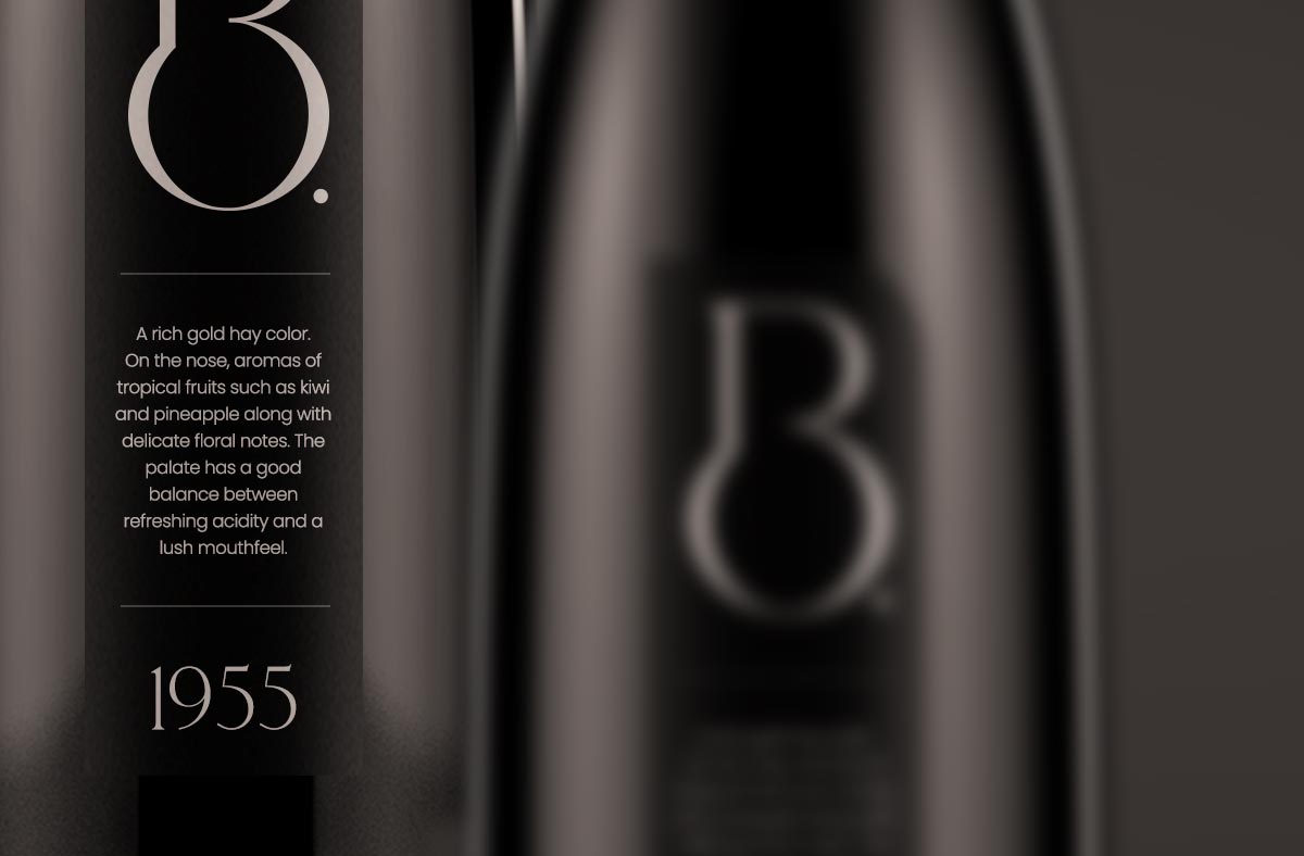
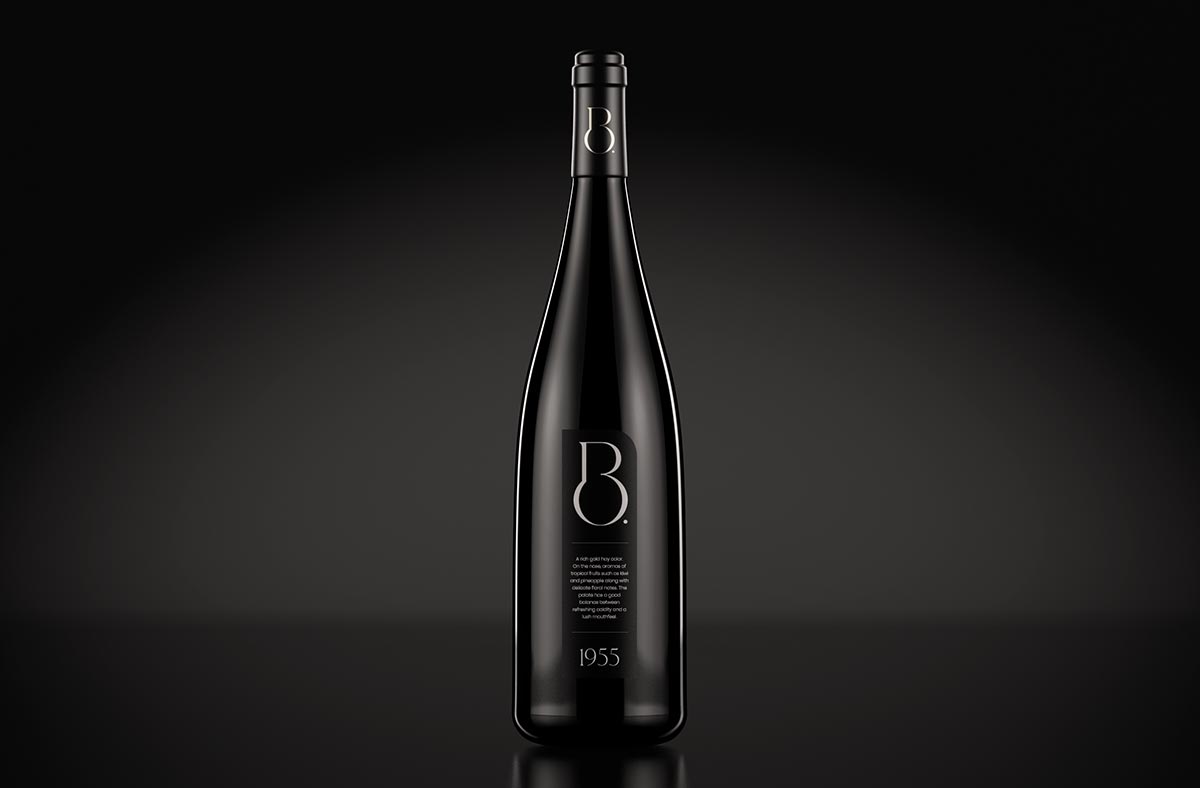
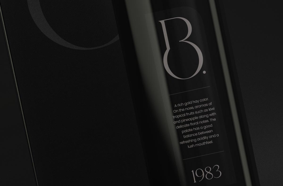
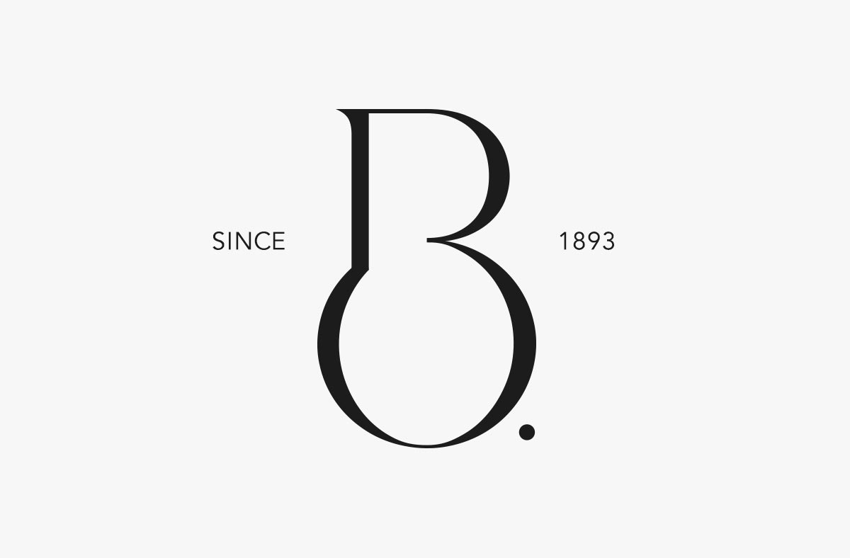
The BO. brand is a winery specialized in producing high-quality wines from processed grapes. The monogram is formed by the fusion of the letters ‘B’ and ‘O’. The concept was sketched by my hand and designed using a unique serif typeface. During the creation of the monogram, I kept in mind a clean design and elegant line management. The resulting logo captivates with its attractive and decorative appearance. The monochromatic color usage enhances the visual impact even further.