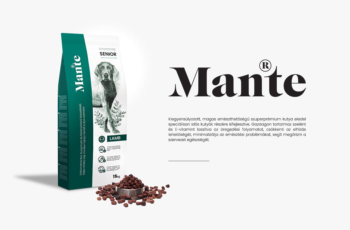
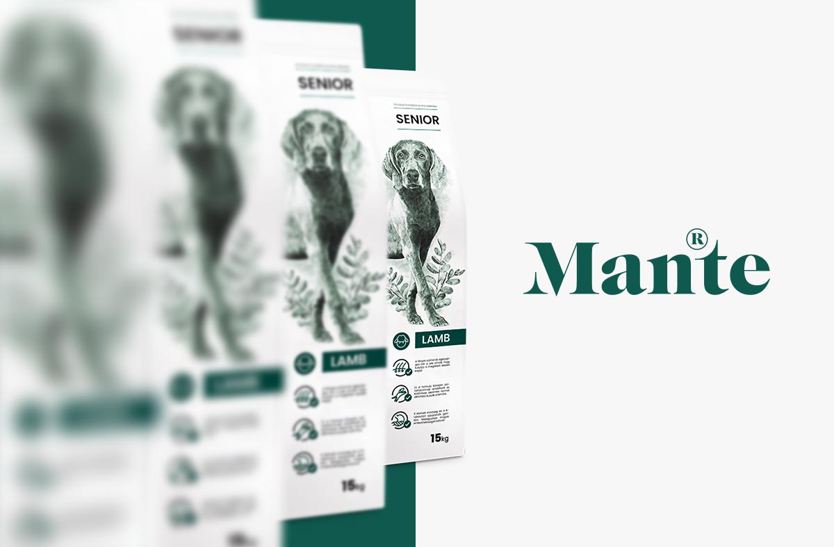
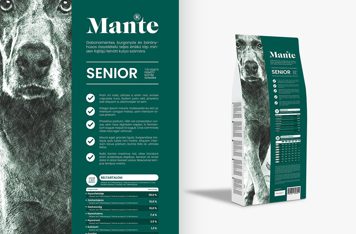
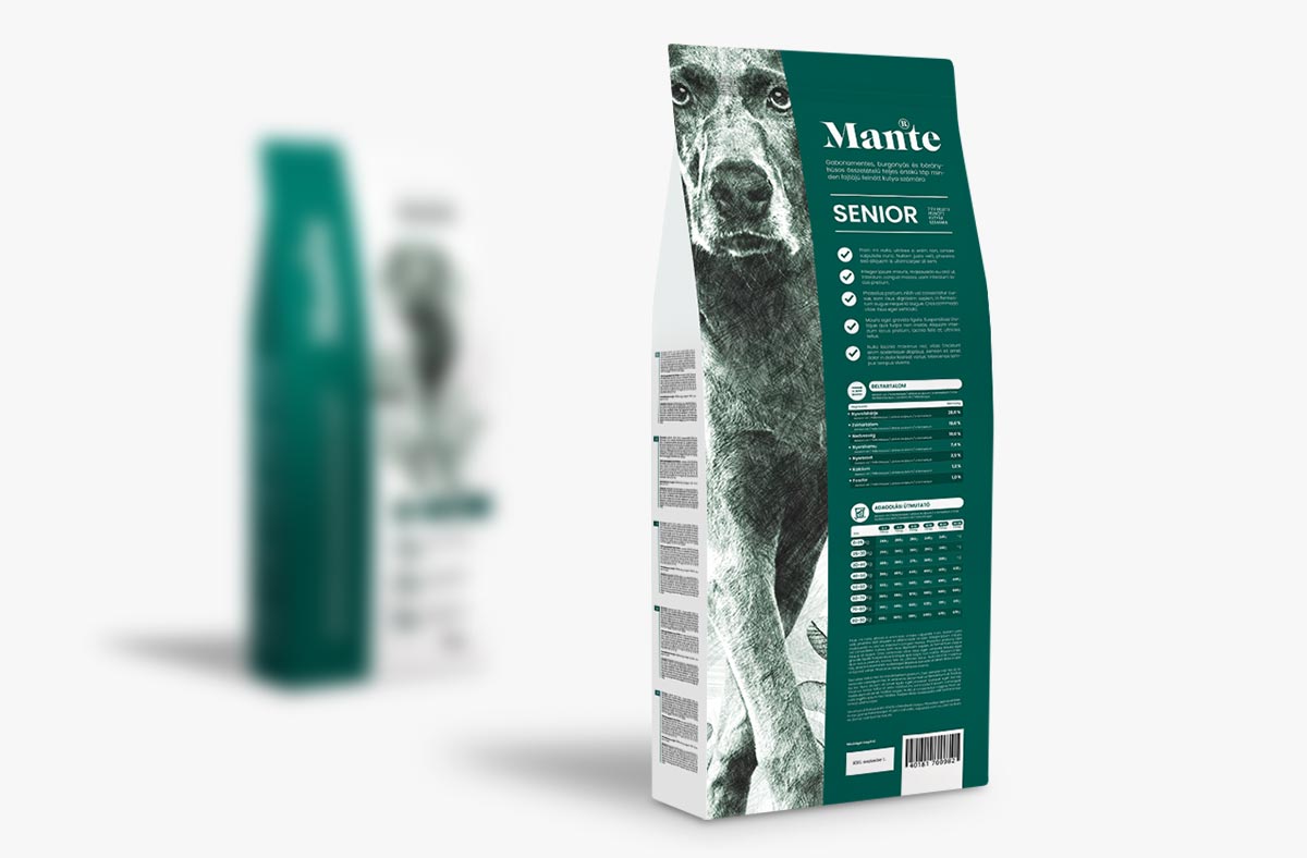
Pet owners are paying increasing attention to the happiness of their beloved pets. Introducing their own branded dry food is a great opportunity for the Petissimo team to strengthen and establish themselves in the market. They aim to create a premium brand under the name ‘Mante’, starting with dry food and later expanding into other product categories. The presentation currently includes the graphic design of the Mante logo and a concept for the dry food packaging category, which will be expanded to include other categories in the future.
The logo of the product is a sophisticated logotype that is easily identifiable. An existing serif font set was transformed. The letter stems carry bold stylistic elements. Thanks to its monochromatic variation, it works well on any surface.
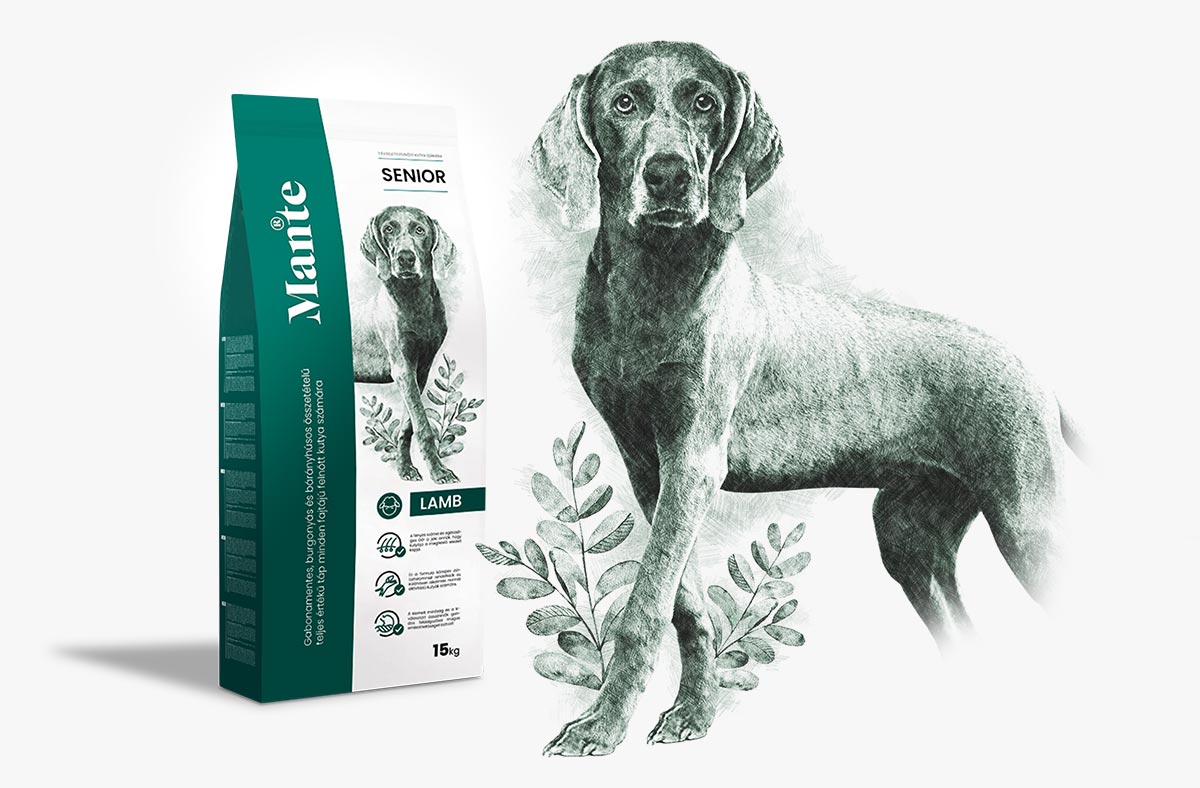
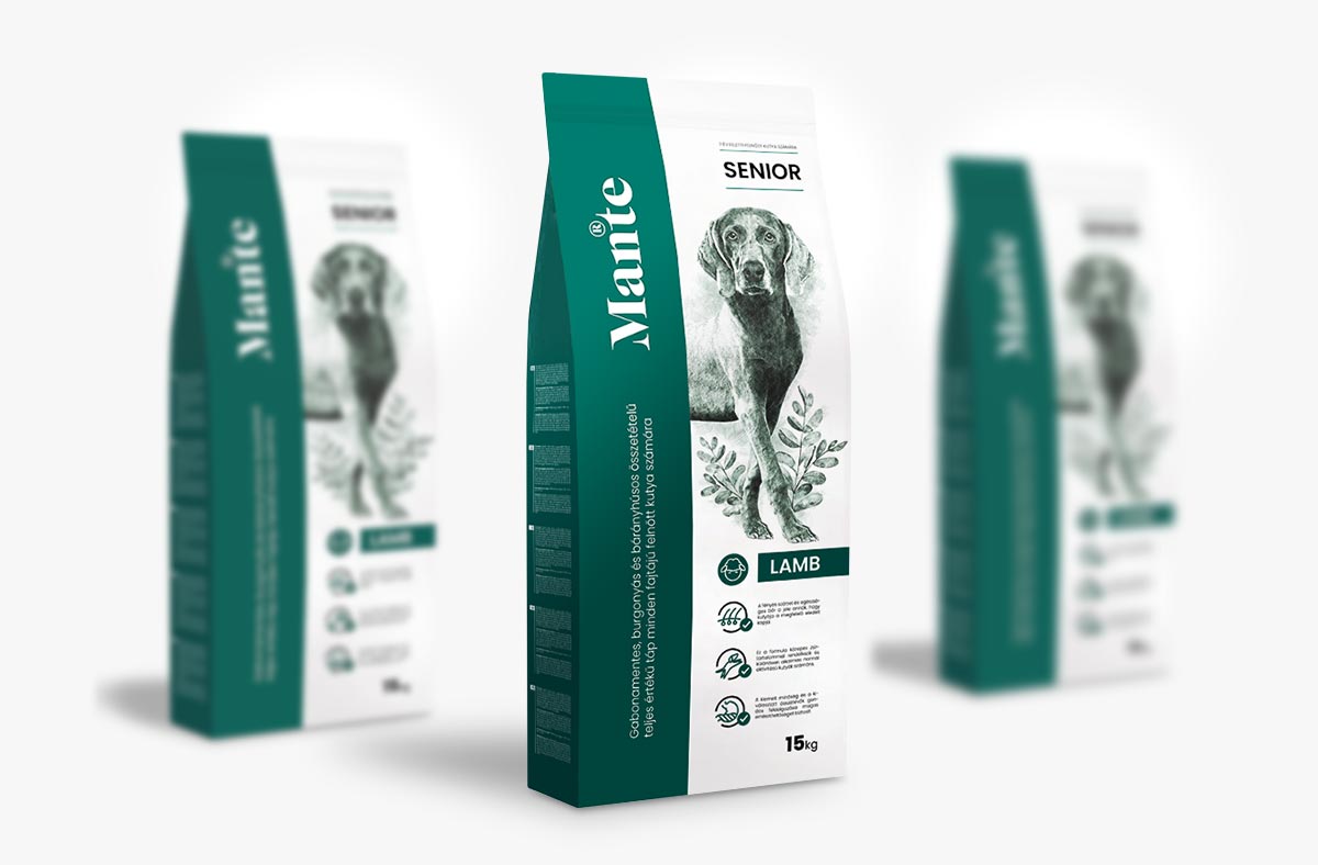
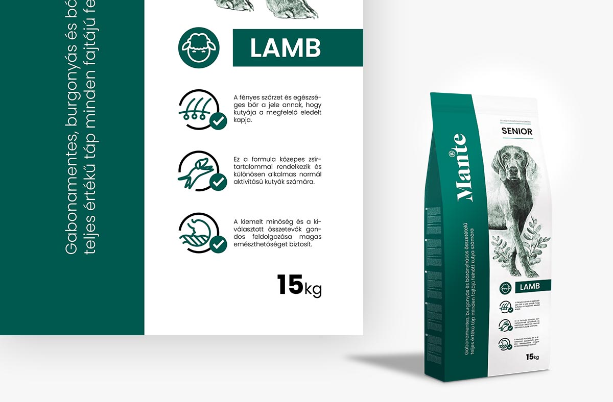
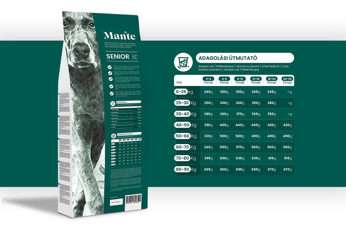
The primary criterion in designing the 15kg dry food was to achieve an unparalleled appearance. Upon seeing the packaging, it becomes clear to the customer that it exudes a premium impression. I created a special pencil drawing as the centerpiece, highlighting the natural aspect. I complemented the textual sections with classic icons. I pay attention even to the smallest details. It was important to me that the end result becomes a work of art.