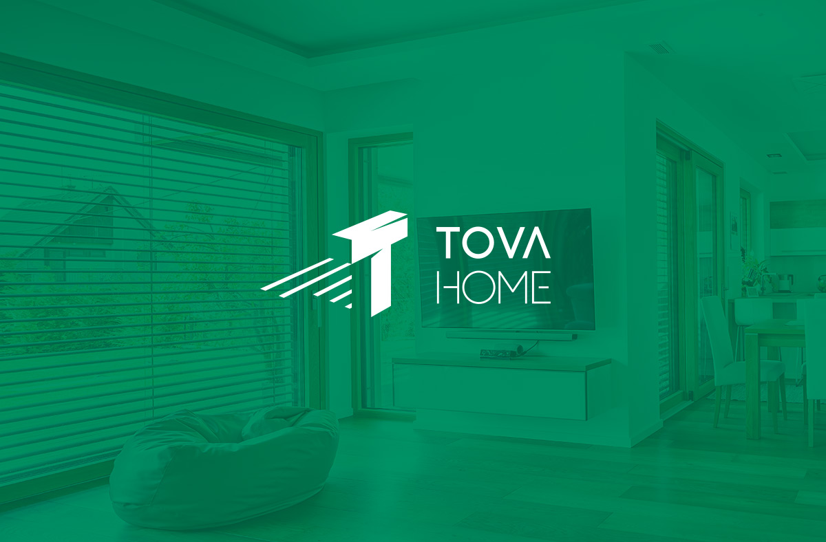
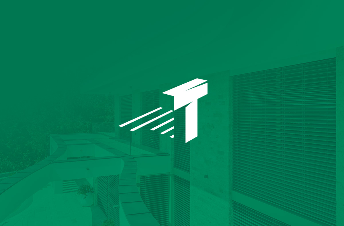
The logo designed for Tova Home conveys the brand’s premium nature and expertise through its clean design and thoughtful details. The foundation of the logo is the ‘T’ letter, subtly shaded to symbolize the company’s core focus: shading solutions. The shadow behind the letter adds visual depth to the logo while also representing the aesthetics and functionality of shading.
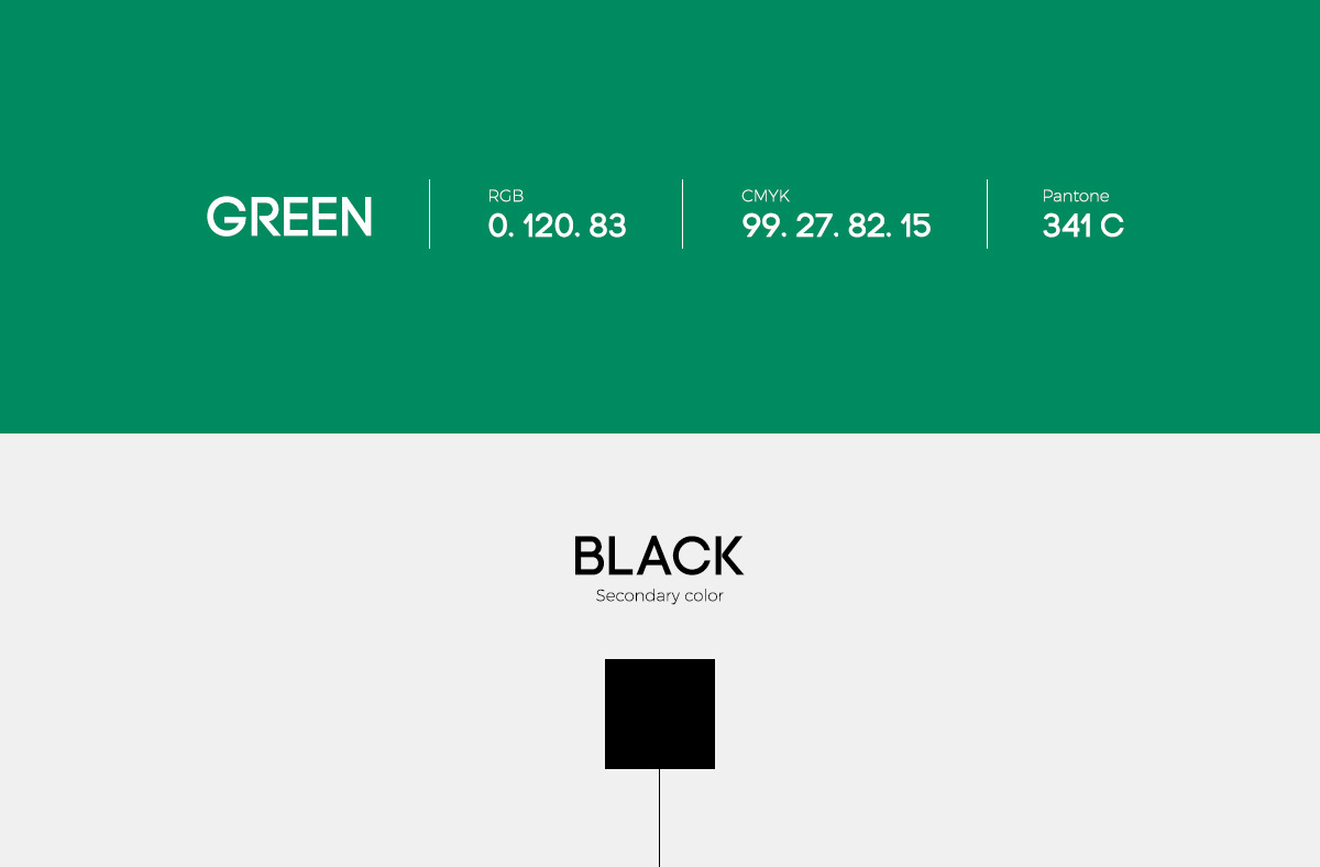
The choice of green as the primary color symbolizes natural and eco-friendly solutions, while also evoking a sense of freshness and tranquility. This color harmonizes with the clean design, which, despite its simplicity, strongly reflects the identity of the Tova Home brand.
This logo is not only visually appealing but also meaningful, perfectly aligning with the company’s philosophy and area of expertise. The combination of simplicity, elegance, and functionality creates an overall effect that highlights Tova Home’s commitment to quality shading solutions.